Creating accessible digital content helps everyone — including people who use assistive technology such as screen readers. Follow these best practices when designing newsletters and emails.
Headings
Make sure headings are in the correct order.
Best Practice: Do not link headings; this can cause confusion for screen reader users.
Every newsletter or email should have only one H1 (main heading).
Don’t use headings just to make text large or bold — use them to organize content.
Follow heading hierarchy:
✅ H2 → H3 (correct)
❌ H2 → H6 (incorrect)
Images
Always include alt text that briefly explains what the image shows or communicates.
❌ “Image of flyer” or “Image”
✅ “Students working together in a classroom”
Embed images directly into emails — don’t link to hosted images.
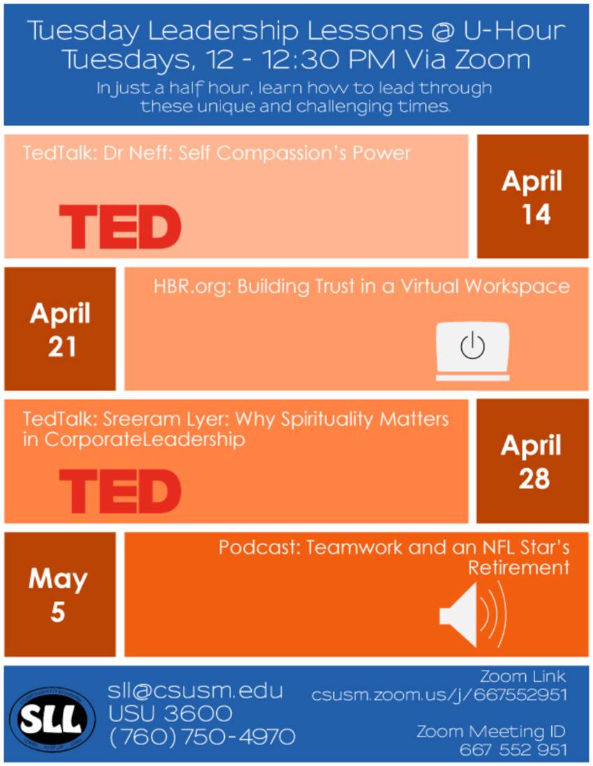
Avoid using images of text (like flyers). Type or paste the text directly into the content editor.
Some users turn off images, and screen readers cannot read text that’s part of an image.
❌ Inaccessible Example

This is an example of a flyer embedded as one image. The actual words can’t be read or navigated by assistive technology.
✅ Accessible Example
Tuesday Leadership Lessons at U-Hour
Tuesdays, 12 – 12:30 PM via Zoom
In just a half hour, learn how to lead through these unique and challenging times.
April 14: Dr. Neff – Self Compassion's Power (TED Talk)
April 21: Building Trust in a Virtual Workspace (HBR.org)
April 28: Sreeram Iyer – Why Spirituality Matters in Corporate Leadership (TED Talk)
May 5: Teamwork and an NFL Star’s Retirement (Podcast)
Links
Write link text that makes sense on its own.
❌ “Click here to register”
✅ “Register for Classes”
Make each link phrase unique when they go to different pages.
Add an underline so links are easy to identify.
QR Codes
QR codes are helpful on printed flyers but not recommended for digital content.
In digital formats, always use links or buttons instead.
Color Contrast & Readability
All district content must have a contrast ratio of 4.5:1 or higher and use a readable font size.
Test your color choices with the WebAIM Color Contrast Checker.
Don’t rely on color alone to convey meaning — color-coded text may be invisible to users with color blindness or low screen brightness.
If color is used, add text labels or other cues to explain what it means.
Accessible Email Signatures
All staff are invited to use the district’s Accessible Email Signature Generator to ensure consistency and ADA compliance.
This tool helps create email signatures that are clear, readable, and accessible to all users.

